One image three ways
In the early days of on-demand television, my husband and I watched a lot of cooking shows, and the chefs would produce elaborate plated variations of ‘the potato‘, or whatever challenge vegetable presented to them. With one simple ingredient they could produce multiple flavors from humble fish-and-chips to sophisticated au gratin recipes.
I argue that we’re wasting a lot of time trying to create three different types of content to serve many masters from Instagram to our websites, when we could carve up a perfect image and serve them to the right audience, with a minimum of effort.
Secret Kitchen Tool: the image editor
I went into the forest on the way home this morning, and took a few snapshots of this magnificent tree, all covered with moss. Snapshots, mind you, with my phone. Nothing fancy here.
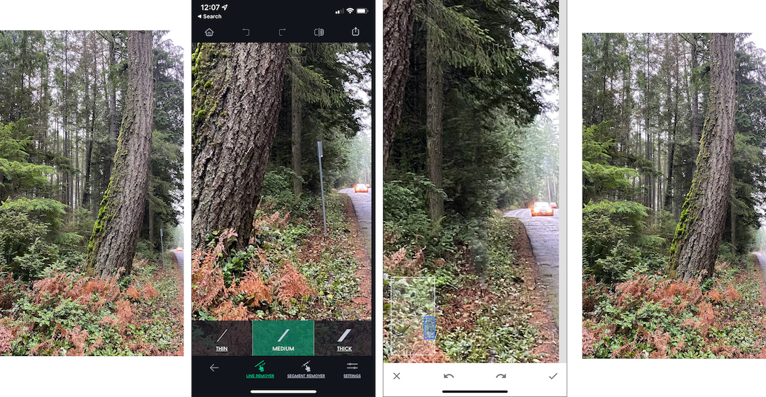
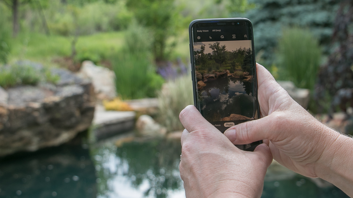
With a few swipes of my fingers, I could edit away the no-parking-sign with the Touch-Retouch app, and I could zoom in using Snapseed and use the Healing tool to erase the car.
Technically, we’re done here. I’ld be quite happy to publish this on my Instagram Stories since its aspect ratio is 9 : 16. There’s even some negative space where I could add a few words, or a question-sticker. The point here is not to overthink this. We’re going for authenticity and conversation here.
INSTAGRAM STORIES AND INSTAGRAM GRID ARE FUNCTIONALLY TWO DIFFERENT APPS
Even though stories are viewed through the same app as the grid, the content is served up to us differently. Some of us want the tasting menu, the highlights of the day from our most active friends. We just rush in, get a flush of enjoyment from this little bite of someone else’s beautiful life, and rush off because it’s our turn at the self-checkout stand.
Others want to sit down and savor the beautiful meal you created. They visit their favorite restaurants (you), catch up on the gossip and leave thoughtful comments, surf a few hashtags, and find a gorgeous new menu to enjoy. These are your Instagram Grid people.
A friend of mine recently posted some magnificent images on her Instagram Stories, that for most of her audience will never see the light of day. She said she didn’t have enough time to repost the images because she had to write a caption and all the things.
What if she just served up the same image on an Instagram Grid sized Plate?
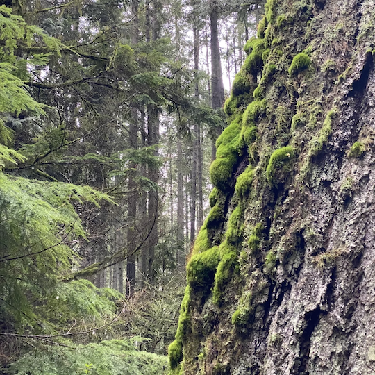
It’s not like this image is all that, but it’s cropped square and starts a conversation about the magical nature of forests in winter.
But that's not all! It slices! It Dices!
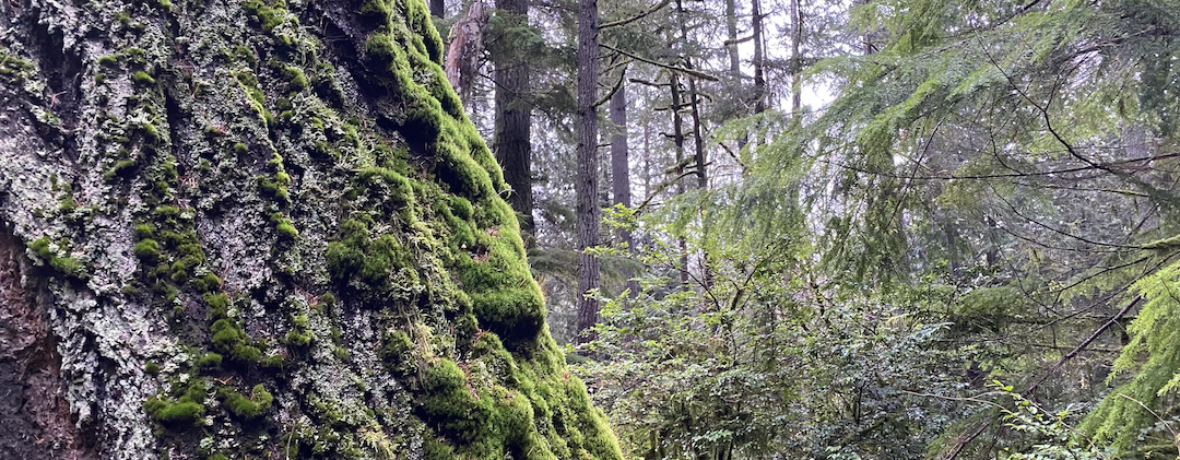
What if you had a little forethought while you were standing there, and rotated your phone?
Because seriously, that extra 30 seconds gives you a nice horizontal image that you can now use on your newsletter and your website. The full-sized image you can use right out of camera on your website, but I cropped this one a bit more tightly to use as the header on my newsletter.
But Grace! You didn’t tell me what actual sizes to use!
I know. It seems like every time I blink the rules change. But here are my three basic principles:
- Square – sides of equal lenth. Use this for profile pictures anywhere, and Instagram Grids
- Vertical – taller than wide. Frequently 9:16 ratio of 1080 pixels x 1920 pixels Use this in Instagram Stories
- Horizontal – wider than tall. Frequently a 4:3-ish ratio of 1200 x 630 pixels used in your website, but I crop them to whatever looks good. In this case I needed the image to be even narrower, so I went with 1080 pixels wide x 400 tall so sort of close to 5:2. Whatever.
Instead of getting into math conniptions, just use whatever pre-set cropping tool is on your phone and go with that.