When container designer Cindy Funes of Garden Revelry is running her crew of installers, she has too much on her mind to think of stopping to set up a photo shoot just to grab content for her social media. And at the end of the day, with everything neatly planted, watered, and fluffed, she’s often just too tired and dusty to try to snap that glamor shot. But we are fortunate to work in an industry where everything is visually beautiful and social media content is everywhere. By understanding what to look for, how to compose a shot before you snap, and how to edit out mistakes quickly, we can share how wonderful our jobs really are.
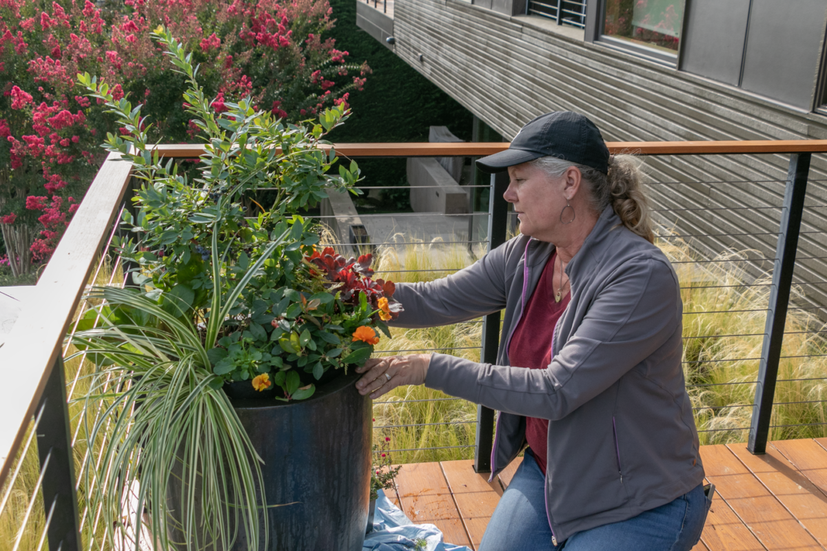
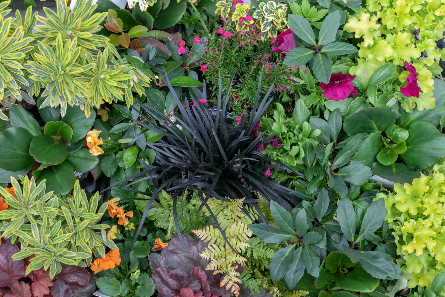
Although the smartphone camera image quality is improving remarkably with every new phone version, I still bring out my dSLR camera for the magazine shots or portfolio images for my website. Yet, having a capable camera in my pocket means I can document particularly colorful happy accidents throughout the day, like the new fall plants that are sitting together ready to be planted at the end of summer glory.
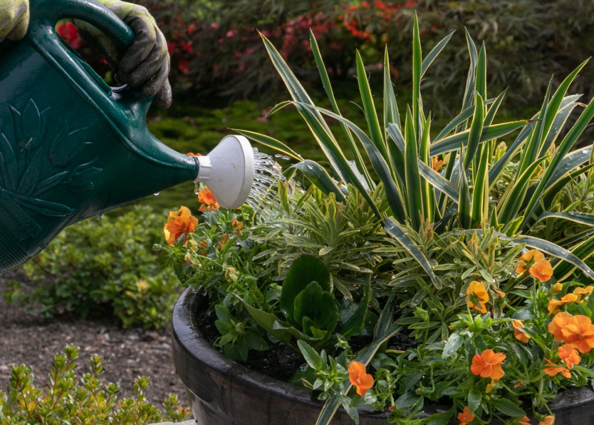
One of the most important things to consider before you even head out to a client site is to figure out what content you need. There’s no point filling up your phone with random shots that you can’t use when you get home. Think about how you want to talk about your business. Before and After images are winners every time. People love to be taken behind the scenes. Are you going out to measure a site? A shot along the tape measure to a focal point would be interesting. Are you choosing stone at the stone yard? Show the variety of options. Tasks that seem ordinary and everyday to us are often particularly compelling content vignettes for the general public and make great social media posts. Look for opportunities to grab an action shot of your team placing stone or finishing fine details.
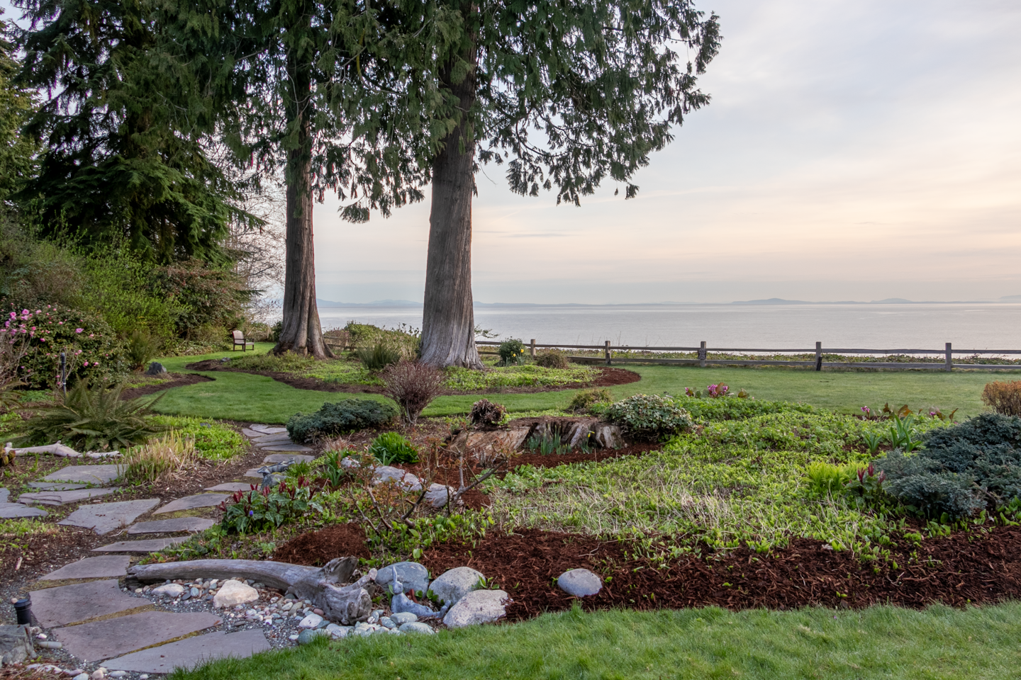
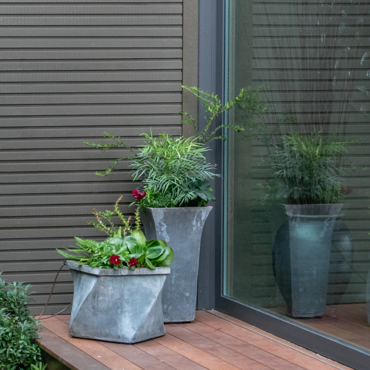
As designers, we already have the advantage of knowing how to see. We see transitions and focal points automatically. We know how to change the angle of view by standing on a chair or getting down low. Consider using a small portable tripod and the timer feature and get into the photo yourself. Start to think like a photographer and look at the edges of your image. Use the frame of your camera to narrow the point of view and cut out any distractions like road signs, hose bibs, or electrical boxes. Get in the practice of moving the garbage bins out of the picture, even if you have to put them back when you’re done. Sweep the patio, fluff the pillows. Show a potential client what’s possible so they can imagine themselves in that garden too.
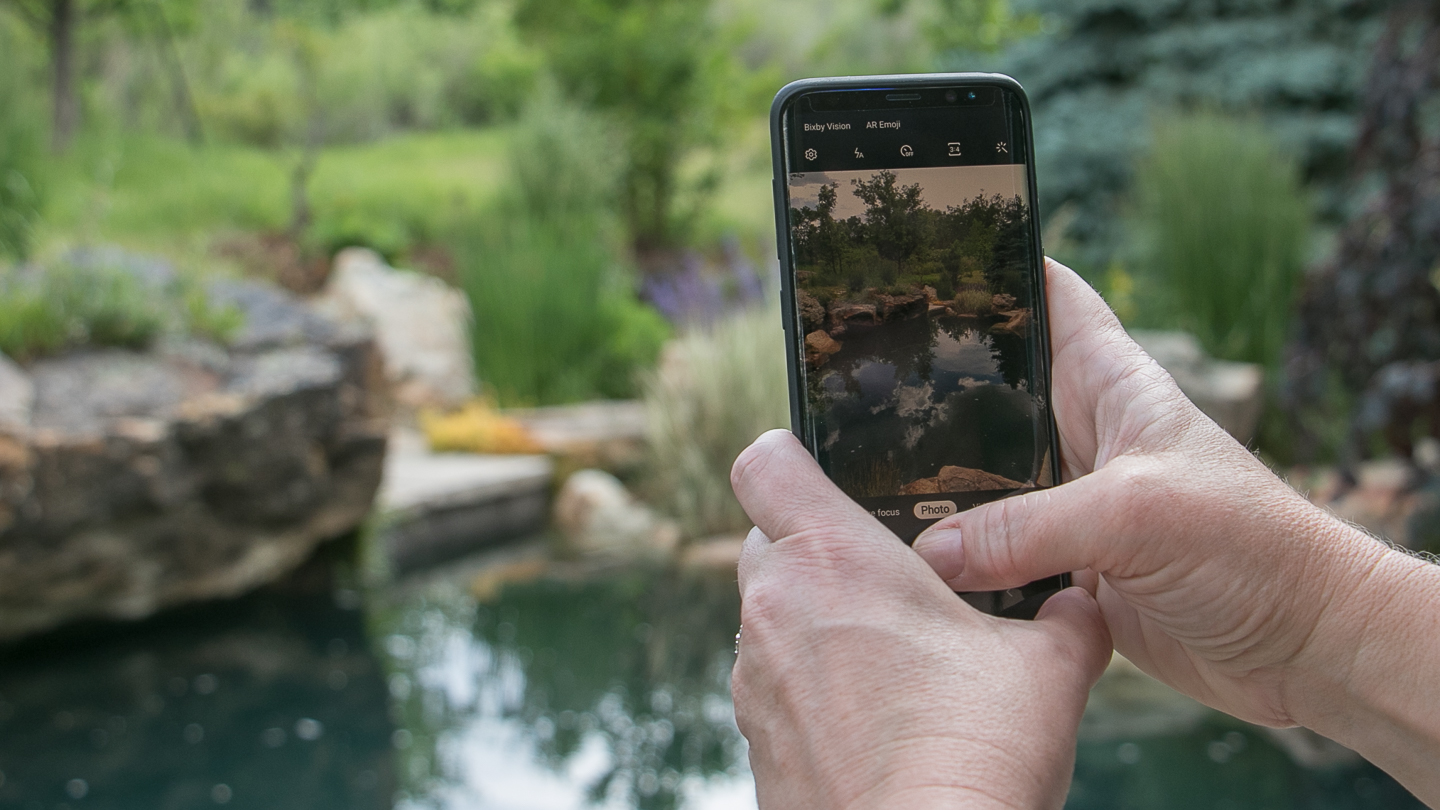
Take the time to learn how your smartphone takes photos and consider investing in a low-cost pro app like Moment, or the monthly Lightroom app subscription. If you press and hold a point on the screen of your smartphone, you can set the auto-focus/auto-exposure option and adjust the exposure before you even snap the photo. Afterwards, if I want an image to be darker and moody, I’ll lower the exposure and highlights. Since an under-exposed image is easier to repair than an over-exposed one, lowering the exposure before you take the photo is a better bet than ending up with bright highlights.
Learn how to use your camera’s built-in editing programs, or use a free app like Snapseed. I use the crop feature liberally and use the 1:1 square format for Instagram posts, though increasingly any size photo such as 3:4 or 5:7 formats are also accepted. This allows me to get rid of distractions on the edges of my image. Rotate a photo by a few degrees to make sure the fence-line or other horizontal and vertical lines look straight; otherwise it can really make an image look out of balance.
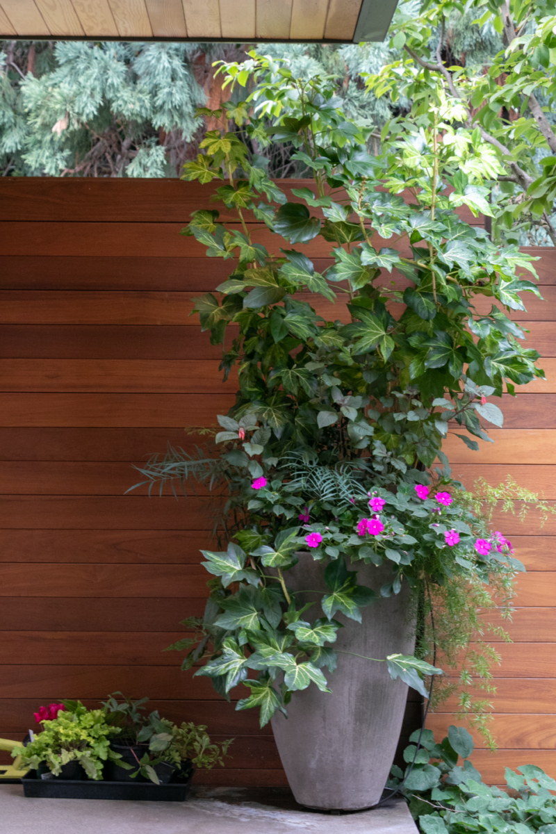
Snapseed, and the pro-level Lightroom app, have other powerful editing features. With a swipe of a finger you can erase small distractions, or change the color balance. Favorite filters can ensure you get a consistent look across multiple posts. In our industry, making sure that the color of a plant or design element is accurate is important.
A pro move is to imagine how the image might look on the cover of a magazine. Leaving breathing room at the top of an image leaves space for the title. A quiet corner means the magazine can place the pricing barcode without obscuring important parts of your photo. This same well-balanced photo can now be used on your website. By anticipating how an image is going to be used, you’ll be able to use and reuse an image, which of course, saves time and money.
Whether or not you take the photos yourself, hire, or tap someone on your crew, take the time to create albums on your phone or in the cloud. I recommend grouping images by job site and marking your favorites so that you can find them quickly. A new feature for iPhones allows you to swipe up and add a caption; using multiple keywords or hashtags makes it easy to find that one photo months later. Google Photos is particularly useful for sharing and organizing images.
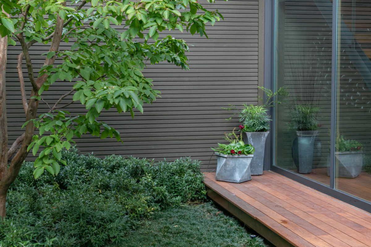
Don’t let the belief that your smartphone can’t take good-enough photos keep you from using this powerful tool for your business. Be fearless and start tapping all of those icons to learn what they can do. Rapid hardware and software upgrades are now taking publication-worthy photos. Merely take the time to decide what’s in the frame and get comfortable editing out any mistakes; it’s what the pros do too.


